CSS Box Model Explained, Margin, Padding, Border and Box Sizing
Learn how the CSS Box Model works with simple explanations, practical examples, formulas, and beginner-friendly exercises.
When you start learning CSS, one concept you will use again and again is the CSS Box Model. Whether you are designing a button, card, navigation bar, image, form, or complete webpage, understanding the box model helps you control the size and spacing of elements.
Many beginners face problems such as:
- “Why is my box wider than I expected?”
- “Why is there extra space around my element?”
- “What is the difference between margin and padding?”
- “Why does adding a border change my element’s size?”
- “Why does
width: 100%sometimes make an element overflow?”
The answer to many of these questions is the CSS Box Model.
What You Will Learn
After completing this tutorial, you will understand:
- What the CSS Box Model is
- The four parts of the box model
- Content area
- Padding
- Border
- Margin
- Width and height
- The standard content-box model
- The border-box model
- box-sizing
- Border radius
- Margin and padding shorthand
- How to calculate an element’s size
- Common box-model mistakes
- How to inspect the box model using browser DevTools
What Is the CSS Box Model?
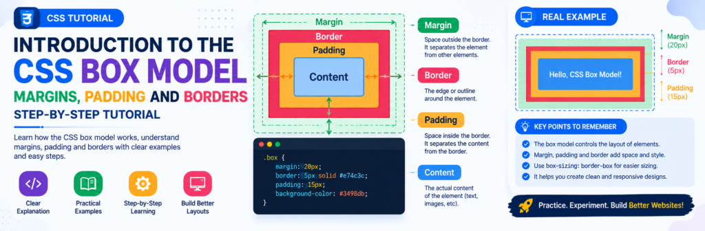
The CSS Box Model describes how the browser calculates the size and spacing of HTML elements.
You can imagine every HTML element as a rectangular box.
For example:
<div>Hello World</div>
Although you see only the words Hello World, the browser treats the <div> as a box.
That box can have:
┌───────────────────────────────┐
│            Margin             │
│   ┌───────────────────────┐   │
│   │        Border         │   │
│   │  ┌─────────────────┐  │   │
│   │  │     Padding     │  │   │
│   │  │  ┌───────────┐  │  │   │
│   │  │  │  Content  │  │  │   │
│   │  │  └───────────┘  │  │   │
│   │  └─────────────────┘  │   │
│   └───────────────────────┘   │
└───────────────────────────────┘
The four main areas are:
Content → Padding → Border → Margin
The content is inside. Padding surrounds the content. Border surrounds the padding. Margin creates space outside the border.
The Four Parts of the CSS Box Model
Let’s understand each part separately.
1. Content
The content area is where the actual content of an element appears.
For example:
<div class="box">
    Learn CSS
</div>
The words Learn CSS are inside the content area.
Images, text, videos, and other child elements can also occupy the content area.
You can control the content area’s dimensions using properties such as:
width: 300px;
height: 150px;
By default, CSS uses the content-box sizing model, meaning the declared width and height refer to the content area.
2. Padding
Padding is the space between the content and the border.
Imagine you create a button:
<button>Click Me</button>
If the text is too close to the edge of the button, you can add padding:
button {
    padding: 15px 25px;
}
Now there is comfortable space between the text and the button’s border.
Simple way to remember
Padding = space inside the element.
For example:
.card {
    padding: 20px;
}
This adds 20px of padding around the content.
You can also control each side separately:
.card {
    padding-top: 10px;
    padding-right: 20px;
    padding-bottom: 30px;
    padding-left: 40px;
}
Padding cannot use negative values.
3. Border
A border surrounds the content and padding.
For example:
.box {
    border: 2px solid black;
}
This creates a 2-pixel solid black border around the element.
A border generally has three important parts:
border-width
border-style
border-color
For example:
.box {
    border-width: 2px;
    border-style: solid;
    border-color: black;
}
The same thing can usually be written more conveniently as:
.box {
    border: 2px solid black;
}
Common border styles
border: 2px solid black;
border: 2px dashed black;
border: 2px dotted black;
You can also style individual sides:
.box {
    border-top: 2px solid black;
    border-right: 2px solid blue;
    border-bottom: 2px solid red;
    border-left: 2px solid green;
}
4. Margin
Margin creates space outside an element.
Suppose you have two cards:
<div class="card">Card One</div>
<div class="card">Card Two</div>
You can separate them with:
.card {
    margin-bottom: 20px;
}
The margin creates space outside the border and separates the element from neighboring elements.
Easy way to remember
Margin = outside space.
Padding = inside space.
This simple difference is extremely important when learning CSS.
Margin vs Padding
Beginners often confuse margin and padding.
Here is the easiest way to understand them:
| Property | Where does it create space? | Main purpose |
|---|---|---|
padding | Inside the border | Creates space around content |
margin | Outside the border | Separates elements |
Think about a cardboard box.
- Content = things inside the box
- Padding = protective space around those things
- Border = edge of the box
- Margin = empty space between this box and another box
Understanding Width and Height
You can set an element’s width and height like this:
.box {
    width: 300px;
    height: 150px;
}
However, there is an important detail.
By default:
box-sizing: content-box;
The specified width applies to the content area, while padding and borders are added around it.
This can surprise beginners.
Understanding the Standard content-box Model
Let’s look at an example:
.box {
    width: 300px;
    padding: 20px;
    border: 5px solid black;
}
The content width is:
300px
Padding is:
20px left + 20px right = 40px
Border is:
5px left + 5px right = 10px
Therefore, the rendered width of the element itself becomes:
300 + 40 + 10 = 350px
So although you wrote:
width: 300px;
the visible box is 350px wide.
This is one of the most important ideas in the CSS Box Model.
The Box Model Formula
For the standard box model:
Total Element Width
=
Content Width
+ Left Padding
+ Right Padding
+ Left Border
+ Right Border
Similarly:
Total Element Height
=
Content Height
+ Top Padding
+ Bottom Padding
+ Top Border
+ Bottom Border
Remember that margin is outside the element’s border box. It creates surrounding space but isn’t part of the element’s own border-box dimensions.
A Practical Calculation Example
Consider this CSS:
.box {
    width: 300px;
    height: 150px;
    padding: 20px;
    border: 5px solid black;
    margin: 10px;
}
Width
Content = 300px
Padding = 20 + 20 = 40px
Border = 5 + 5 = 10px

Element width = 300 + 40 + 10
              = 350px
Height
Content = 150px
Padding = 20 + 20 = 40px
Border = 5 + 5 = 10px

Element height = 150 + 40 + 10
               = 200px
The margin then provides 10px of space around the element.
What Is box-sizing?
The box-sizing property controls how the browser calculates an element’s declared width and height.
The two values you should know first are:
content-box
and
border-box
box-sizing: content-box
This is the default behavior.
.box {
    box-sizing: content-box;
}
When using content-box, the declared width represents the content area.
For example:
.box {
    width: 300px;
    padding: 20px;
    border: 5px solid black;
}
The final element width is:
300 + 40 + 10 = 350px
box-sizing: border-box
The border-box model works differently.
.box {
    box-sizing: border-box;
}
Now the declared width includes:
- Content
- Padding
- Border
For example:
.box {
    width: 300px;
    padding: 20px;
    border: 5px solid black;
    box-sizing: border-box;
}
The entire border box remains:
300px
The browser reduces the available content area so the padding and border fit inside the declared width.
This behavior is often more convenient when creating layouts.
A Common CSS Reset for Box Sizing
You will often see developers use:
html {
    box-sizing: border-box;
}

*,
*::before,
*::after {
    box-sizing: inherit;
}
This makes border-box behavior apply consistently through inheritance.
For beginners, another commonly seen approach is:
* {
    box-sizing: border-box;
}
Understanding border-box will make responsive layouts and width calculations much easier.
CSS Margin Shorthand
You don’t always need to write four separate properties.
Instead of:
margin-top: 10px;
margin-right: 20px;
margin-bottom: 30px;
margin-left: 40px;
You can write:
margin: 10px 20px 30px 40px;
The order is:
Top → Right → Bottom → Left
A useful way to remember it is to imagine moving clockwise around the box.
One Value
margin: 20px;
All four sides become 20px.
Two Values
margin: 10px 20px;
This means:
Top/Bottom = 10px
Left/Right = 20px
Three Values
margin: 10px 20px 30px;
This means:
Top = 10px
Left/Right = 20px
Bottom = 30px
Four Values
margin: 10px 20px 30px 40px;
This means:
Top = 10px
Right = 20px
Bottom = 30px
Left = 40px
Padding Shorthand
Padding works in the same way.
One value
padding: 20px;
All sides are 20px.
Two values
padding: 10px 20px;
Top and bottom are 10px.
Left and right are 20px.
Three values
padding: 10px 20px 30px;
Top = 10px
Left/right = 20px
Bottom = 30px
Four values
padding: 10px 20px 30px 40px;
Top = 10px
Right = 20px
Bottom = 30px
Left = 40px
CSS border-radius
The border-radius property allows you to create rounded corners.
For example:
.card {
    border-radius: 10px;
}
This makes the corners rounded.
You can create a circle when the element is square:
.profile {
    width: 100px;
    height: 100px;
    border-radius: 50%;
}
This technique is commonly used for profile images, avatars, icons, and circular UI elements.
Complete Box Model Example
Let’s create a simple card.
HTML
<div class="card">
    <h2>Learn CSS</h2>
    <p>
        CSS allows you to style and design beautiful websites.
    </p>
    <button>Start Learning</button>
</div>
CSS
.card {
    width: 300px;
    padding: 25px;
    border: 2px solid #333;
    margin: 30px;
    border-radius: 12px;
    box-sizing: border-box;
}

.card h2 {
    margin-top: 0;
}

.card button {
    padding: 10px 18px;
    border: 0;
    border-radius: 6px;
}
Here:
widthcontrols the card’s declared width.paddingcreates space inside the card.bordercreates the visible edge.marginseparates the card from other elements.border-radiusrounds the corners.box-sizing: border-boxkeeps padding and border inside the declared width.
Why Does width: 100% Sometimes Overflow?
This is a common beginner problem.
Suppose you write:
input {
    width: 100%;
    padding: 15px;
    border: 2px solid black;
}
With the default content-box model, the 100% width applies to the content area, and padding and borders are added on top of it.
As a result, the input can become wider than its parent.
Using:
input {
    width: 100%;
    box-sizing: border-box;
}
makes the declared width include the padding and border.
This is one reason border-box is useful when building responsive forms and layouts.
Margin Collapsing
There is another box-model behavior beginners should know: margin collapsing.
In some block-layout situations, the vertical margins of adjacent elements can combine rather than simply being added together.
For example:
.first {
    margin-bottom: 30px;
}

.second {
    margin-top: 20px;
}
You might expect:
30 + 20 = 50px
But in certain normal-flow situations, the margins can collapse and the resulting space may be closer to the larger margin:
30px
Margin collapsing has specific rules, so don’t assume every pair of margins will simply add together.
As you become more comfortable with CSS layout, learning margin collapsing will help you understand unexpected vertical spacing.
Block and Inline Elements
The box model also behaves differently depending on whether an element participates as a block or inline box.
Typical block elements include:
<div>
<p>
<h1>
<section>
Inline elements include:
<span>
<a>
<strong>
<em>
For normal inline elements, width and height do not work in the same way they do for block boxes, and top/bottom margins have limited effect.
This is why understanding display becomes important after learning the box model.
Using Browser DevTools to Understand the Box Model
If you are confused about the size or spacing of an element, your browser’s Developer Tools can help.
Step 1
Right-click an element on your webpage.
Step 2
Choose:
Inspect
Step 3
Open the Computed or Layout section of Developer Tools.
You can see the different areas of the element, including:
Margin
Border
Padding
Content
This is one of the best ways to understand why an element has a particular size or spacing.
Common CSS Box Model Mistakes
Mistake 1: Confusing Margin and Padding
Incorrect thinking:
Margin = inside
Padding = outside
Correct:
Padding = inside
Margin = outside
Mistake 2: Forgetting About Borders
If you use:
width: 300px;
border: 5px solid black;
with the default content-box, the border is added outside the 300px content width.
Mistake 3: Assuming Width Means Total Width
With:
width: 300px;
padding: 20px;
border: 5px solid black;
the total element width is not 300px under the standard box model.
It becomes:
350px
Mistake 4: Using Too Much Margin
Large margins can create unnecessary gaps between elements.
Instead of randomly increasing margin, inspect the element and determine whether you actually need:
margin
or:
padding
Mistake 5: Using width: 100% Without Considering Padding
For responsive forms and containers, consider:
box-sizing: border-box;
so padding and borders are included within the declared width.
CSS Box Model Cheat Sheet
| Property | Purpose |
|---|---|
width | Sets width |
height | Sets height |
padding | Space inside the border |
margin | Space outside the border |
border | Visible edge around padding/content |
border-radius | Rounds corners |
box-sizing | Controls how width and height are calculated |
Frequently Asked Questions
What is the CSS Box Model?
The CSS Box Model describes how an HTML element’s content, padding, border, and margin are arranged and how they contribute to its size and surrounding space.
What is the difference between margin and padding?
Padding creates space inside the border, between the content and border.
Margin creates space outside the border, separating the element from surrounding elements.
What is the default value of box-sizing?
The default is:
content-box
With content-box, the declared width and height apply to the content area, while padding and border are added to the rendered dimensions.
What does box-sizing: border-box do?
It makes the declared width and height include the content, padding, and border.
Can padding be negative?
No. CSS padding cannot use negative values.
Can margin be negative?
Yes, margins can have negative values, although they should be used carefully because they can cause elements to overlap.
Why is my element larger than its width?
If you are using the default content-box model, padding and borders are added to the declared width.
Try:
box-sizing: border-box;
when you want padding and borders included inside the declared dimensions.
Learn Next Topic
CSS3 transitions and hover effects basic tutorial for beginners

About Techanees
Techanees is a technology platform sharing simple tutorials, useful guides, web development tips, and the latest tech updates for beginners and enthusiasts.


weed for sleep gummies natural relief
very interesting tutorial
fantastic article
Well structured tutorial…
Very detailed informative blog
Educad is very informative platform