Introduction to Flexbox, What is Flexbox?
The basics of Flexbox, a powerful CSS layout tool used to create responsive and flexible layouts.
how to use Flexbox properties to align, distribute, and order elements on a webpage.
- The Flexbox, Flexible Box Layout is a CSS layout model that allows you to arrange elements in rows or columns, distribute space, and align items.
- It simplifies creating flexible, responsive designs compared to using floats or manually setting margins.
CSS Flexbox, Flexible Box Layout
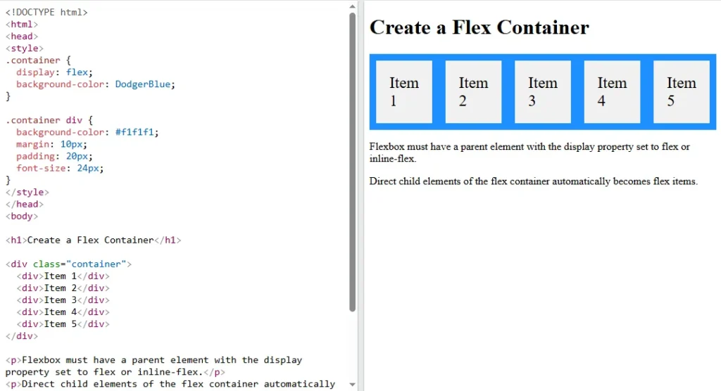
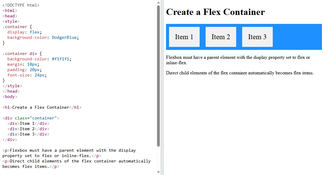
- To use flexbox, you need to set a container’s display property to flex, making the container a flex container, and its direct children become flex items.
Create a Flexbox Container
Basic Flexbox Terms, CSS Flexbox Components
- The Main Axis The primary axis along which the flex items are laid out can be horizontal or vertical and the Cross Axis The axis perpendicular to the main axis.
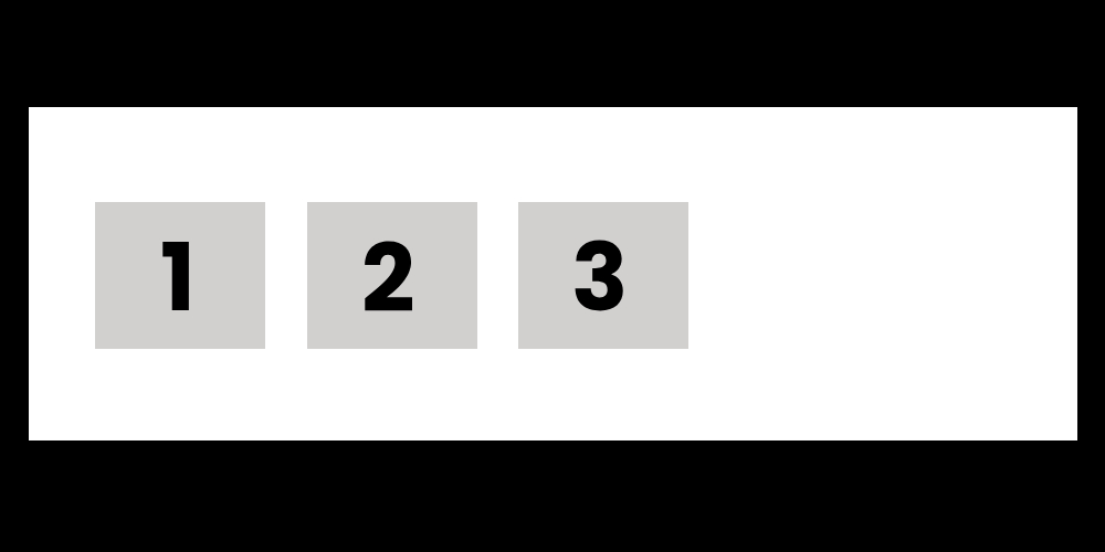
- A Flex Container and one or more Flex Items.
A CSS Flex Container with Three Flex Items
- The
.containeris set todisplay:flex, making it a flex container and each .item becomes a flex item, Theflex:1;property makes the items grow equally to fill the available space.
Flexbox Properties for Containers
- The
flex-directionspecifies the direction of theflex itemsrow or columns and values are row, column, row-reverse, column-reverse. - The
justify-contentaligns flex items along the main axis horizontally by default and values are flex-start, center, flex-end, space-between, space-around. - The
align-itemsaligns flex items along the cross axis vertically and values are stretch, center, flex-start, flex-end. - The
flex-wrapallows flex items to wrap onto multiple lines and values are nowrap is default, wrap, wrap-reverse.
Flex-direction Row
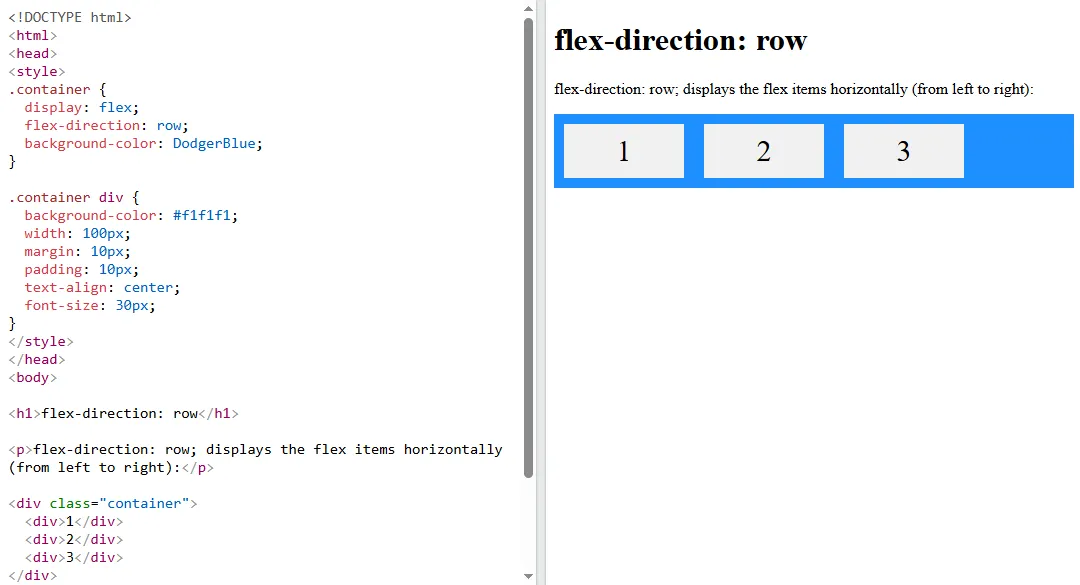
- The
Flex-direction: rowarranges the flex items horizontally. TheJustify-content:space-betweendistributes space between the items. - Ensuring equal space between them and the
Align-items:centeraligns the items vertically in the middle of the container.
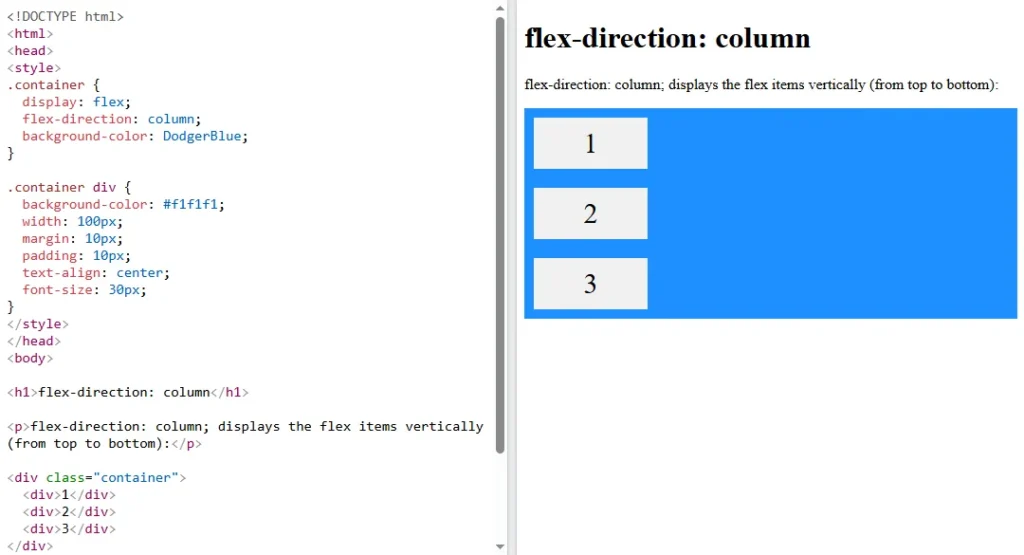
Flex-direction Column
CSS Flexbox Properties for Flex Items
- The flex-grow controls how much the flex item grows relative to the others and values are any number the default is 0, meaning no growth.
- The flex-shrink controls how much the flex item shrinks relative to the others and values are any number the default is 1, meaning items shrink as needed.
- The flex-basis defines the default size of the flex item before any growing or shrinking. And Values Can be a length
100pxor can be100%percentage. - The order specifies the order of the flex items. Lower numbers appear first. And values are any number default is 0.
Flex-grow Items
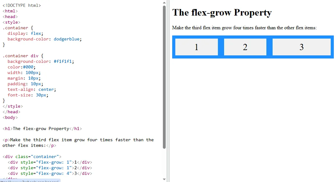
- The
flex-grow: 2makes the item grow twice as fast as other items with flex-grow 1.flex-basis: 100pxsets the initial size of the item to 100px before applying growth or shrink.
Responsive Design with Flexbox
- The flexbox simplifies building responsive layouts that adjust to different screen sizes.
- By using Flexbox and media queries, you can change the layout for smaller devices.
Making Layouts Responsive in different devices
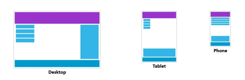
- The
flex-wrap: wrapallows the items to wrap onto the next line if there’s not enough space.
- The media query adjusts the layout on small screens in smartphones setting
flex-basis: 100%to make each item take up the full width.
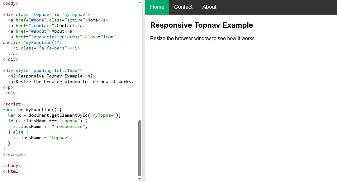
Building a Responsive Navigation Bar
Use flexbox to create a responsive navigation bar
- To create a navigation bar with links for Home, About, and Contact. Use
display:flexto align the links in a row. - Add a media query to stack the links vertically on smaller screens.
Navigation bar layout with Media query to resize on multiple devices
Very helpful tutorials
Nice
very detailed information
Amazing Content
nice blog
Beautifully designed
An incredibly well-written article.