Introduction to CSS Responsive Web Design & Media Queries
What is Responsive Web Design?
- The CSS responsive web design is to make web pages or websites that will run smoothly and automatically adjust for different screen sizes and viewports on all electronic devices like mobile phones, personal computers and laptops.
CSS Responsive web design video that adjust screen sizes and viewport.
What are CSS Media Queries?
The CSS Responsive Design & Media Queries are a feature of CSS that allows the application of different styles based on the properties of the user’s device, such as screen width, height, orientation, and resolution.
Media queries are most commonly used to make websites responsive, adjusting layout and design elements based on the viewport size.
The CSS Media Query Syntax
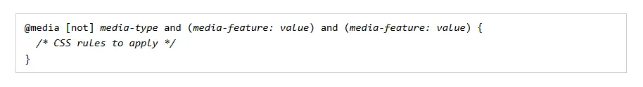
- The Media queries is true is the specified media-type matches the type of device of mobile, tablet or desktop.
- When a CSS media query is true, the corresponding style rules are applied and change the device size and viewport.
- The Min-width applies the styles to screen sizes greater than or equal to the specified width.
- The Max-width applies the styles to screen sizes less than or equal to the specified width.
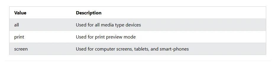
CSS Media Types
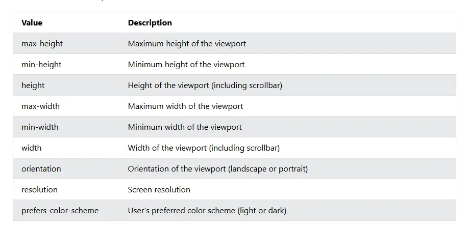
CSS Media Features
The CSS media feature specifies a specific characteristic of the device. Some commonly used media features are as under.
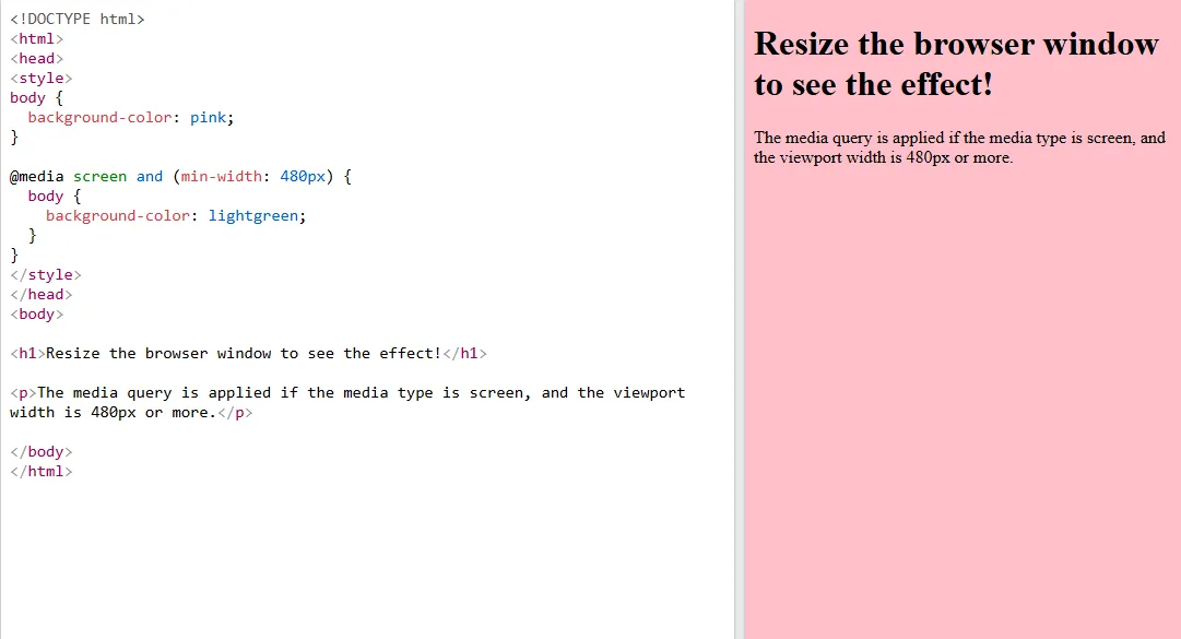
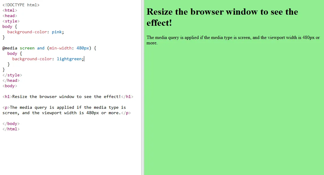
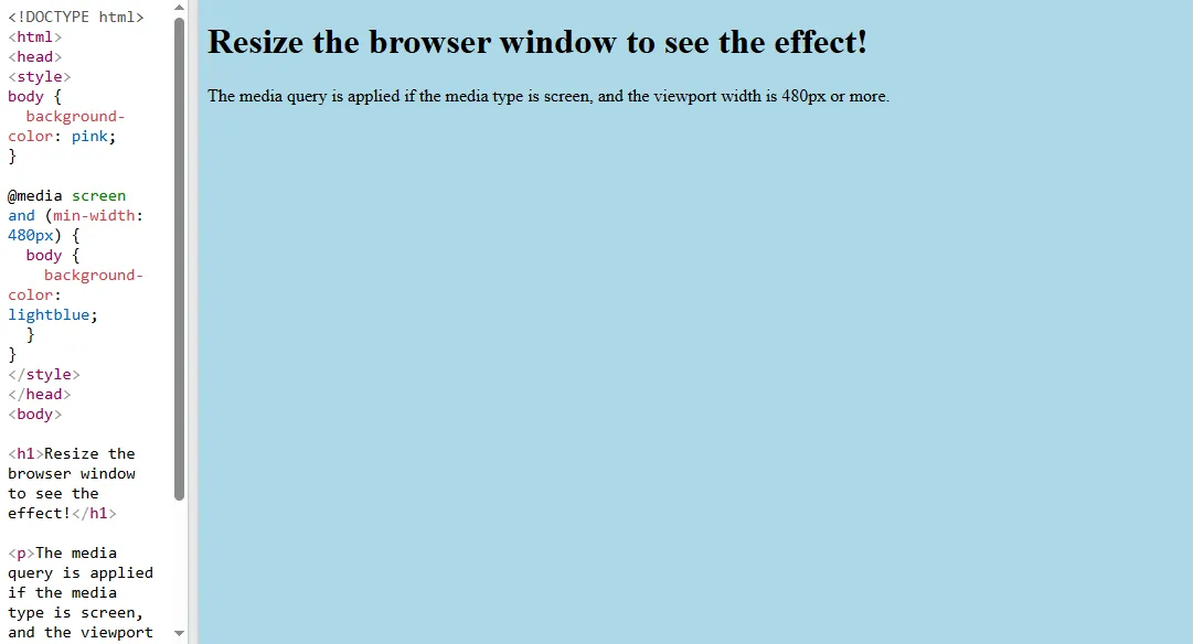
Media Queries Demonstration
The media query is applied if the media type is screen, and the viewport width is 400px.
- Before resizing the browser window
- This is typically used for mobile devices with a screen width of up to 400px.
- After Resizing the browser window
- This target on screens of tablets with a width between 600px and 900px.
- Desktop for large devices
- This Generally for desktop screens wider than 900px and more.
Adjusting Layouts for Different Screen Sizes & Responsive Layout Adjustments
- Font Sizes and Spacing:
- Adjust font sizes, line heights, and padding to ensure readability on smaller screens.
- Product Grid Adjustments:
- On smaller screens, display product grids as single-column layouts, and switch to multi-column grids for larger screens.
- Header and Navigation Adjustments
- For mobile views, simplify the navigation into a hamburger menu or stack the links vertically.
Mobile-First Design Approach
What is the Mobile-First Approach?
The mobile-first approach means designing the website layout and styles for mobile devices first, and then scaling up the design for larger screens.
This approach ensures that the website is optimized for smaller screens, where space is limited, and progressively enhances the design for larger screens.
Why is this important?
Mobile traffic now represents the majority of website visits, making it essential to prioritize mobile usability.
It helps with performance optimization, ensuring that mobile users receive a faster experience.
How to Implement Mobile-First Design?
- Start with the default styles for small screens in mobile.
- Add media queries for larger screens on tablet and desktop as needed.
Testing Responsiveness with Browser Dev Tools
- Chrome DevTools and other browsers provide a powerful device simulation feature to test websites across multiple screen sizes without needing physical devices.
- Open the DevTools right-click Inspect or press Ctrl + Shift + I.
- Click on the Toggle Device Toolbar button Ctrl + Shift + M to simulate different devices.
- Select from a list of common devices iPhone, iPad, etc. or enter custom screen and sizes to test the responsiveness of their design.
If this tutorial was helpful please feel free to comment box section below.
Understanding how Media Queries work is key for truly responsive layouts – I found a helpful overview of responsive design principles, including some visual examples This tutorial is a good starting point for getting a handle on the CSS itself.