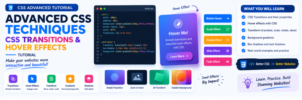
CSS Transitions and Hover Effects: Simple Tutorial for Beginners
Have you ever noticed that when you move your mouse over a button, the button changes color smoothly?
Or when you place your mouse over an image, the image becomes slightly larger?
These small effects make a website feel more interactive and professional.
The good news is that you do not need JavaScript to create many of these effects.
With CSS transitions, hover effects, transforms, and a few simple CSS properties, you can create attractive animations with just a few lines of code.
What You Will Learn
In this tutorial, you will learn:
- What CSS transitions are
- How
transitionworks - How to create hover effects
- How to change colors smoothly
- How to change button size
- How to use
transform - How to create image hover effects
- How to create card hover effects
- How to create simple navigation effects
- How to create animated buttons
- How to combine transitions and transforms
- Common CSS transition mistakes
- How to create a small practical project
What Is a CSS Transition?
A CSS transition makes a change happen smoothly over a period of time.
For example, without a transition:
button:hover {
    background-color: blue;
}
The color changes immediately when you move the mouse over the button.
With a transition:
button {
    transition: background-color 0.3s;
}

button:hover {
    background-color: blue;
}
The color changes smoothly.
Think of it like this:
Without transition

Normal ────────> Hover
       instantly


With transition

Normal ──> slowly changes ──> Hover
This is the main purpose of CSS transitions.
The Basic transition Property
The simplest syntax is:
element {
    transition: property duration;
}
For example:
button {
    transition: background-color 0.3s;
}
Here:
background-coloris the property being animated.0.3sis the duration.
You can use different durations:
transition: background-color 0.2s;
transition: background-color 0.5s;
transition: background-color 1s;
For small interface effects, durations around a fraction of a second often feel natural.
Creating Your First Hover Effect
Let’s create a simple button.
HTML
<button class="button">
    Hover Me
</button>
CSS
.button {
    background-color: black;
    color: white;
    padding: 12px 24px;
    border: none;
    cursor: pointer;

    transition: background-color 0.3s;
}

.button:hover {
    background-color: blue;
}
Move your mouse over the button.
The background color changes smoothly.
What Does :hover Mean?
:hover is a CSS pseudo-class.
It allows you to apply styles when the pointer is positioned over an element.
Example:
button:hover {
    background-color: green;
}
The rule is applied while the element is being hovered.
You can use :hover with many elements:
a:hover {
    color: red;
}
.card:hover {
    transform: translateY(-5px);
}
img:hover {
    opacity: 0.8;
}
Changing Multiple Properties
You can transition multiple properties.
Example:
.button {
    background-color: black;
    color: white;
    transform: scale(1);

    transition:
        background-color 0.3s,
        color 0.3s,
        transform 0.3s;
}

.button:hover {
    background-color: blue;
    color: white;
    transform: scale(1.05);
}
Now the button changes its background and size smoothly.
Using transition: all
You may also see:
transition: all 0.3s;
This means transitions can apply to all properties that are changing.
For simple demonstrations, this is convenient.
However, in larger projects it can be better to specify the properties you actually want to animate:
transition:
    transform 0.3s,
    background-color 0.3s;
This makes your CSS more intentional.
The Four Main Transition Properties
CSS provides several transition-related properties.
The main ones are:
transition-property
transition-duration
transition-timing-function
transition-delay
They can also be combined using the shorthand:
transition: property duration timing-function delay;
Let’s understand them.
transition-property
This tells CSS which property should transition.
Example:
button {
    transition-property: background-color;
}
Only the background color is being transitioned.
Another example:
.card {
    transition-property: transform;
}
transition-duration
This controls how long the transition takes.
Example:
button {
    transition-duration: 0.3s;
}
You can use seconds:
transition-duration: 1s;
or milliseconds:
transition-duration: 300ms;
These represent the same amount of time:
1 second = 1000 milliseconds
Therefore:
0.3s = 300ms
transition-timing-function
The timing function controls how the transition progresses over time.
Common values include:
linear
ease
ease-in
ease-out
ease-in-out
Example:
button {
    transition:
        transform 0.3s ease;
}
linear
The animation progresses at a relatively constant rate.
transition: transform 0.3s linear;
ease
Starts and finishes more gently.
transition: transform 0.3s ease;
ease-in
Starts more slowly.
transition: transform 0.3s ease-in;
ease-out
Finishes more gently.
transition: transform 0.3s ease-out;
ease-in-out
Starts and finishes gently.
transition: transform 0.3s ease-in-out;
For many beginner interface effects, ease or ease-out is a good starting point.
transition-delay
A delay determines how long the browser waits before starting the transition.
Example:
button {
    transition:
        background-color 0.3s ease 0.2s;
}
The transition waits briefly before beginning.
You can also write:
button {
    transition-property: background-color;
    transition-duration: 0.3s;
    transition-delay: 0.2s;
}
For normal buttons and navigation links, large delays can feel slow, so use them carefully.
Understanding CSS Transform
The transform property is extremely useful for hover effects.
It allows you to visually transform an element.
Common transform functions include:
translate()
scale()
rotate()
skew()
Let’s look at each one.
scale()
scale() changes the size of an element.
Example:
.card:hover {
    transform: scale(1.05);
}
The card becomes slightly larger.
For a button:
button:hover {
    transform: scale(1.05);
}
A value of:
scale(1)
means normal size.
A value of:
scale(1.1)
makes it larger.
A value of:
scale(0.9)
makes it smaller.
translateY()
translateY() moves an element vertically.
Example:
.card:hover {
    transform: translateY(-5px);
}
The card moves slightly upward.
This is a very popular card hover effect.
translateX()
translateX() moves an element horizontally.
.button:hover {
    transform: translateX(5px);
}
The button moves slightly to the right.
rotate()
You can rotate an element.
.icon:hover {
    transform: rotate(15deg);
}
You can also rotate in the opposite direction:
.icon:hover {
    transform: rotate(-15deg);
}
A small rotation usually works better for interface elements than a very large rotation.
Combining Transform Functions
Transform functions can be combined.
Example:
.card:hover {
    transform:
        translateY(-5px)
        scale(1.02);
}
Now the card moves upward and becomes slightly larger.
Another example:
.icon:hover {
    transform:
        rotate(10deg)
        scale(1.1);
}
Creating a Simple Card Hover Effect
Let’s create a practical card.
HTML
<div class="card">

    <h2>Learn CSS</h2>

    <p>
        Learn CSS properties and create
        beautiful websites.
    </p>

    <a href="#">Read More</a>

</div>
CSS
.card {
    width: 300px;
    padding: 25px;

    border: 1px solid #ddd;
    border-radius: 12px;

    transition:
        transform 0.3s ease,
        box-shadow 0.3s ease;
}

.card:hover {
    transform: translateY(-8px);

    box-shadow:
        0 10px 25px rgba(0, 0, 0, 0.15);
}
When you move the mouse over the card:
- It moves upward.
- A shadow appears.
- Both changes happen smoothly.
Simple Button Animation
Here is another useful example.
HTML
<button class="learn-button">
    Start Learning
</button>
CSS
.learn-button {
    padding: 12px 25px;

    background-color: #222;
    color: white;

    border: none;
    border-radius: 8px;

    cursor: pointer;

    transition:
        transform 0.2s ease,
        background-color 0.3s ease;
}

.learn-button:hover {
    background-color: #444;
    transform: translateY(-3px);
}
This creates a small movement when the user hovers over the button.
Image Hover Effect
Images can also use transitions.
HTML
<div class="image-box">
    <img
        src="image.jpg"
        alt="Learning CSS"
    >
</div>
CSS
.image-box {
    overflow: hidden;
}

.image-box img {
    display: block;

    width: 100%;

    transition:
        transform 0.4s ease;
}

.image-box:hover img {
    transform: scale(1.08);
}
The image smoothly zooms when the pointer moves over it.
The important part is:
overflow: hidden;
It prevents the enlarged image from visually spilling outside its container.
Link Hover Effect
Links do not have to change only their color.
Example:
.nav-link {
    color: black;
    text-decoration: none;

    transition:
        color 0.3s ease;
}

.nav-link:hover {
    color: blue;
}
You can also create an underline effect.
.nav-link {
    position: relative;
    text-decoration: none;
}

.nav-link::after {
    content: "";

    position: absolute;

    left: 0;
    bottom: -5px;

    width: 0;
    height: 2px;

    background-color: blue;

    transition:
        width 0.3s ease;
}

.nav-link:hover::after {
    width: 100%;
}
The underline grows from left to right.
Changing Opacity
The opacity property controls how transparent an element appears.
Example:
.image {
    opacity: 1;

    transition:
        opacity 0.3s ease;
}

.image:hover {
    opacity: 0.7;
}
The image becomes slightly transparent on hover.
You can combine opacity with transform:
.image:hover {
    opacity: 0.8;
    transform: scale(1.03);
}
Creating a Simple Glow Effect
You can use box-shadow to create a glow-like effect.
.button {
    transition:
        box-shadow 0.3s ease;
}

.button:hover {
    box-shadow:
        0 0 20px rgba(0, 100, 255, 0.4);
}
The shadow appears smoothly when the button is hovered.
Hover Effects on Icons
Icons can also be animated.
Example:
<div class="icon">
    ★
</div>
CSS:
.icon {
    display: inline-block;

    transition:
        transform 0.3s ease;
}

.icon:hover {
    transform:
        rotate(10deg)
        scale(1.1);
}
Because transforms work on the element visually, icons and small decorative elements are good candidates for this type of effect.
CSS Transitions With Border
You can transition borders too.
.button {
    border: 2px solid black;

    transition:
        border-color 0.3s ease;
}

.button:hover {
    border-color: blue;
}
You can also combine border and background changes:
.button {
    background: white;
    color: black;
    border: 2px solid black;

    transition:
        background-color 0.3s ease,
        color 0.3s ease,
        border-color 0.3s ease;
}

.button:hover {
    background: black;
    color: white;
    border-color: black;
}
A Complete Hover Card
Now let’s combine several techniques.
HTML
<div class="course-card">

    <div class="course-icon">
        CSS
    </div>

    <h2>
        Learn CSS
    </h2>

    <p>
        Learn CSS from the basics and
        build beautiful responsive websites.
    </p>

    <a href="#" class="course-link">
        Start Learning
    </a>

</div>
CSS
.course-card {
    width: 320px;

    padding: 30px;

    border-radius: 15px;

    border: 1px solid #ddd;

    background: white;

    transition:
        transform 0.3s ease,
        box-shadow 0.3s ease;
}

.course-card:hover {
    transform:
        translateY(-8px);

    box-shadow:
        0 12px 30px
        rgba(0, 0, 0, 0.15);
}

.course-icon {
    display: inline-block;

    padding: 10px 15px;

    border-radius: 8px;

    background: #222;
    color: white;

    transition:
        transform 0.3s ease;
}

.course-card:hover .course-icon {
    transform:
        scale(1.08)
        rotate(3deg);
}

.course-link {
    display: inline-block;

    color: black;

    text-decoration: none;

    transition:
        transform 0.3s ease;
}

.course-link:hover {
    transform:
        translateX(5px);
}
Notice something important:
.course-card:hover .course-icon
This means:
When the course card is hovered, change the icon inside it.
This allows you to create coordinated effects between parent and child elements.
Why Put transition on the Normal Element?
Consider this:
.card {
    transition: transform 0.3s ease;
}

.card:hover {
    transform: translateY(-5px);
}
This is better than:
.card:hover {
    transition: transform 0.3s ease;
    transform: translateY(-5px);
}
The transition should normally be placed on the element’s normal state.
That way, the browser knows how to animate both:
Normal → Hover
Hover → Normal
So when the pointer leaves the card, it can smoothly return to its original position.
Transition vs Animation
CSS transitions and CSS animations are related, but they are not the same.
A transition normally happens when a property changes between states.
For example:
button:hover {
    transform: scale(1.05);
}
An animation can run through a sequence of keyframes.
Example:
@keyframes bounce {
    0% {
        transform: translateY(0);
    }

    50% {
        transform: translateY(-20px);
    }

    100% {
        transform: translateY(0);
    }
}
Then:
.box {
    animation: bounce 1s;
}
A simple way to remember:
Transition
State A → State B

Animation
Keyframe 1 → Keyframe 2 → Keyframe 3 → ...
For hover effects, transitions are often the simpler choice.
Common CSS Transition Mistakes
Mistake 1: Forgetting transition
If you write:
button:hover {
    background-color: blue;
}
the change happens immediately.
Add:
button {
    transition:
        background-color 0.3s ease;
}
Mistake 2: Putting Transition Only in :hover
Avoid:
button:hover {
    transition: transform 0.3s;
}
Prefer:
button {
    transition: transform 0.3s;
}

button:hover {
    transform: scale(1.05);
}
Mistake 3: Making Effects Too Large
This:
transform: scale(1.5);
may be too dramatic for a small button.
A subtle effect is often better:
transform: scale(1.05);
Mistake 4: Using Very Long Transitions
This:
transition: all 5s;
can make a simple button feel slow.
For small interface interactions, start with a short duration and adjust it based on how the effect feels.
Mistake 5: Animating Everything
Not every element needs an animation.
Use effects where they help users understand interaction.
Good candidates include:
- Buttons
- Links
- Cards
- Images
- Navigation items
- Icons
Accessibility and Hover Effects
Remember that not every user interacts with a website using a mouse.
Some people use:
- Keyboard navigation
- Touchscreens
- Assistive technologies
Therefore, important information should not exist only inside a hover effect.
For interactive controls, also consider keyboard focus.
Example:
button:hover,
button:focus-visible {
    transform: translateY(-3px);
}
This gives keyboard users a visible focus-related interaction as well.
Also avoid making important content appear only when someone hovers over it.
Respecting Reduced Motion
Some users prefer less animation.
CSS provides a media query that can respond to that preference:
@media (prefers-reduced-motion: reduce) {

    *,
    *::before,
    *::after {
        scroll-behavior: auto;
        transition-duration: 0.01ms;
        animation-duration: 0.01ms;
    }

}
The exact implementation can vary depending on the project, but the important idea is to avoid forcing unnecessary motion on users who have requested reduced motion.
Complete Mini Project: Animated Course Card
Let’s finish with a small project that combines the main concepts.
HTML
<!DOCTYPE html>
<html lang="en">

<head>

    <meta charset="UTF-8">

    <meta
        name="viewport"
        content="width=device-width, initial-scale=1.0"
    >

    <title>CSS Hover Card</title>

    <link rel="stylesheet" href="style.css">

</head>

<body>

    <main class="container">

        <article class="card">

            <div class="icon">
                CSS
            </div>

            <h1>
                Learn CSS
            </h1>

            <p>
                Learn CSS transitions, hover effects,
                transforms and responsive design.
            </p>

            <a href="#" class="button">
                Start Learning
            </a>

        </article>

    </main>

</body>

</html>
CSS
* {
    box-sizing: border-box;
}

body {
    margin: 0;

    min-height: 100vh;

    display: grid;
    place-items: center;

    font-family: Arial, sans-serif;

    background: #f5f5f5;
}

.container {
    width: min(100% - 32px, 400px);
}

.card {
    padding: 30px;

    background: white;

    border-radius: 16px;

    border: 1px solid #ddd;

    text-align: center;

    transition:
        transform 0.3s ease,
        box-shadow 0.3s ease;
}

.card:hover {
    transform:
        translateY(-8px);

    box-shadow:
        0 15px 35px
        rgba(0, 0, 0, 0.15);
}

.icon {
    display: inline-block;

    padding: 12px 18px;

    background: #222;
    color: white;

    border-radius: 8px;

    font-weight: bold;

    transition:
        transform 0.3s ease;
}

.card:hover .icon {
    transform:
        scale(1.1)
        rotate(4deg);
}

.button {
    display: inline-block;

    padding: 12px 20px;

    background: #222;
    color: white;

    text-decoration: none;

    border-radius: 8px;

    transition:
        transform 0.2s ease,
        background-color 0.3s ease;
}

.button:hover {
    background-color: #444;

    transform:
        translateY(-3px);
}

@media (prefers-reduced-motion: reduce) {

    *,
    *::before,
    *::after {
        transition: none !important;
    }

}
Frequently Asked Questions
What is a CSS transition?
A CSS transition smoothly changes a CSS property from one value to another over a specified period.
What is a hover effect?
A hover effect is a visual change that occurs when the pointer is positioned over an element.
For example:
button:hover {
    background-color: blue;
}
Do CSS hover effects require JavaScript?
No. Many simple hover effects can be created entirely with CSS.
What is the difference between transition and transform?
transition controls how a property changes over time.
transform changes an element’s visual position, size, rotation, or other geometric transformation.
They are often used together:
.card {
    transition: transform 0.3s ease;
}

.card:hover {
    transform: translateY(-5px);
}
What is scale()?
scale() changes the visual size of an element.
Example:
transform: scale(1.05);
What is translateY()?
translateY() moves an element vertically.
Example:
transform: translateY(-5px);
What is transition-duration?
It specifies how long a transition takes.
Example:
transition-duration: 0.3s;
What is transition-timing-function?
It controls the speed pattern of a transition.
Common values include:
linear
ease
ease-in
ease-out
ease-in-out
Learn Next Tutorial
Responsive Web Design for beginners with CSS Media Queries

About Techanees
Techanees is a technology platform sharing simple tutorials, useful guides, web development tips, and the latest tech updates for beginners and enthusiasts.

very nice tutorial