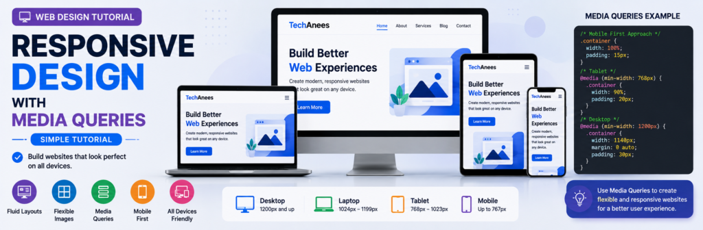
Responsive Web Design With CSS Media Queries, Complete Beginner Tutorial
Today, people visit websites using many different screen sizes. One visitor may open your website on a small mobile phone, another on a tablet, while someone else may use a laptop or a large desktop monitor.
If your website has been designed for only one screen size, it may look perfect on your computer but become difficult to use on another device.
Text might become too small.
Images might overflow outside the screen.
Navigation links might not fit.
Columns might become too narrow.
Buttons might become difficult to tap.
This is where responsive web design becomes important.
What You Will Learn
By the end of this lesson, you will understand:
- What responsive web design is
- Why websites need responsive design
- What a viewport is
- Why the viewport meta tag is important
- What CSS media queries are
- Media query syntax
min-widthandmax-width- Mobile-first responsive design
- How to choose breakpoints
- Responsive typography
- Responsive images
- Responsive navigation
- Responsive Flexbox layouts
- Responsive CSS Grid layouts
- Orientation media queries
- User-preference media queries
- How to test responsive websites
- Common responsive design mistakes
- How to build a complete responsive webpage
What Is Responsive Web Design?
Responsive Web Design, commonly shortened to RWD, is an approach to designing websites so that their content and layout adapt to different screen sizes.
Instead of building a completely separate website for mobile phones, tablets, laptops, and desktops, we create one flexible website that can adjust itself.
Imagine that we have three cards on a desktop screen:
+----------+  +----------+  +----------+
|  Card 1  |  |  Card 2  |  |  Card 3  |
+----------+  +----------+  +----------+
There is enough horizontal space to show all three cards in one row.
However, displaying the same three-column layout on a small mobile screen may make each card too narrow.
A responsive design may change it to:
+------------------+
|      Card 1      |
+------------------+

+------------------+
|      Card 2      |
+------------------+

+------------------+
|      Card 3      |
+------------------+
The content has not changed.
Only its layout has adapted to the available space.
Why Is Responsive Design Important?
A modern website may be visited from:
- Smartphones
- Tablets
- Laptops
- Desktop computers
- Large monitors
- Devices in portrait mode
- Devices in landscape mode
Responsive design helps make the website comfortable to use across these different environments.
A responsive website can provide:
- Easier reading
- Better navigation
- Flexible images
- Better use of available space
- More usable buttons and forms
- Better mobile experience
- More consistent layouts
Responsive design is therefore not simply about making everything smaller.
The goal is to make the layout appropriate for the available space.
HTML, CSS and Responsive Design
To understand responsive design, remember the purpose of the main web technologies.
HTML
  ↓
Website Structure

CSS
  ↓
Website Appearance and Layout

Media Queries
  ↓
Change CSS under certain conditions
For example, normal CSS may create three columns.
.cards {
    display: grid;
    grid-template-columns: repeat(3, 1fr);
}
A media query can change those columns when the available width becomes smaller.
@media (max-width: 700px) {
    .cards {
        grid-template-columns: 1fr;
    }
}
The same HTML now behaves differently depending on the viewport width.
What Is the Viewport?
The viewport is the visible area of a webpage inside the browser.
On a desktop computer, the viewport may be very wide.
On a mobile phone, it is much narrower.
Responsive CSS normally reacts to this available viewport space.
The Viewport Meta Tag
Responsive webpages should normally include this line inside the HTML <head>:
<meta name="viewport" content="width=device-width, initial-scale=1.0">
A basic page might therefore begin like this:
<!DOCTYPE html>
<html lang="en">
<head>
    <meta charset="UTF-8">

    <meta
        name="viewport"
        content="width=device-width, initial-scale=1.0"
    >

    <title>Responsive Website</title>
</head>

<body>

</body>
</html>
The viewport meta tag tells mobile browsers to use the device’s available width appropriately when displaying the page.
Without correct viewport configuration, responsive CSS may not behave as expected on mobile devices.
What Is a CSS Media Query?
A media query allows CSS rules to be applied only when a particular condition is true.
The condition could involve:
- Viewport width
- Viewport height
- Screen orientation
- Printing
- Pointer characteristics
- User preferences
- Other environmental features
For beginner responsive design, viewport width is the most common place to start.
Basic Media Query Syntax
The basic syntax is:
@media (condition) {
    /* CSS rules */
}
For example:
@media (max-width: 600px) {
    body {
        background-color: lightgray;
    }
}
This means:
Apply this background color when the viewport width is 600px or less.
Understanding max-width
Consider:
@media (max-width: 600px) {
    h1 {
        font-size: 28px;
    }
}
The CSS inside the media query applies when the viewport is no wider than 600px.
Conceptually:
0px --------------------- 600px ---------------------->

       Media query active
This approach is commonly seen when a desktop layout is written first and styles are then changed for smaller widths.
Understanding min-width
Now consider:
@media (min-width: 768px) {
    .container {
        display: flex;
    }
}
The styles apply when the viewport is at least 768px wide.
Conceptually:
0px ----------- 768px ------------------------------>

                 Media query active
min-width is particularly common in mobile-first design.
min-width vs max-width
A simple way to remember them is:
min-width
Start applying styles from this width upward.

max-width
Apply styles until this maximum width.
Examples:
@media (min-width: 700px) {
    /* wider screens */
}
and:
@media (max-width: 699px) {
    /* narrower screens */
}
Do not think of them only as “tablet” or “mobile” rules.
Think about the amount of space your content needs.
What Is a Breakpoint?
A breakpoint is the point where you decide the design needs to change.
For example:
@media (min-width: 768px) {
    /* layout changes */
}
Here, 768px is a breakpoint.
However, responsive design should not simply choose random numbers because a particular phone or tablet has that width.
A better approach is:
- Start with your content.
- Resize the browser.
- Observe the layout.
- Find where the design stops looking comfortable.
- Add a breakpoint there.
Your content should help determine your breakpoints.
Mobile-First Responsive Design
A popular responsive design technique is called mobile-first design.
With mobile-first CSS, we first create the basic layout for narrow screens.
Then we progressively enhance the design for wider screens.
For example:
.container {
    padding: 16px;
}

.cards {
    display: grid;
    grid-template-columns: 1fr;
}
This is our default mobile layout.
Then:
@media (min-width: 700px) {
    .cards {
        grid-template-columns: repeat(2, 1fr);
    }
}
And:
@media (min-width: 1000px) {
    .cards {
        grid-template-columns: repeat(3, 1fr);
    }
}
The layout becomes:
Small screen
────────────
1 column


Medium screen
─────────────
2 columns


Wide screen
───────────
3 columns
This is a clean way to progressively enhance a website as more space becomes available.
Desktop-First Design
Another approach is desktop-first.
You create the large-screen version first:
.cards {
    display: grid;
    grid-template-columns: repeat(3, 1fr);
}
Then reduce the columns:
@media (max-width: 900px) {
    .cards {
        grid-template-columns: repeat(2, 1fr);
    }
}
And:
@media (max-width: 600px) {
    .cards {
        grid-template-columns: 1fr;
    }
}
Both approaches can work.
For many new projects, however, mobile-first CSS is a useful approach because you begin with a simpler narrow-screen layout and enhance it as space becomes available.
Example: Responsive Container
A common website container may be written as:
.container {
    width: min(100% - 32px, 1200px);
    margin-inline: auto;
}
This means the container can shrink on narrow screens but will not continuously expand beyond 1200px.
This is often better than writing:
.container {
    width: 1200px;
}
because a fixed 1200px width can overflow small screens.
Avoid Fixed Widths for Main Layouts
Consider:
.wrapper {
    width: 1000px;
}
On a screen narrower than 1000 pixels, this may create horizontal scrolling.
A more flexible solution could be:
.wrapper {
    width: 90%;
    max-width: 1000px;
    margin: auto;
}
Now the wrapper can shrink.
Responsive Images
Images are another common cause of horizontal overflow.
Suppose an image is larger than the viewport.
A useful basic rule is:
img {
    max-width: 100%;
    height: auto;
}
max-width: 100% prevents the image from becoming wider than its container.
height: auto helps preserve its proportions.
Example
HTML:
<div class="article-image">
    <img src="website.jpg" alt="Responsive website">
</div>
CSS:
.article-image img {
    display: block;
    max-width: 100%;
    height: auto;
}
Now the image scales within the available area.
Responsive Typography
Fonts can also respond to available space.
A simple media-query approach is:
h1 {
    font-size: 2rem;
}

@media (min-width: 768px) {
    h1 {
        font-size: 3rem;
    }
}
The heading is smaller on narrow screens and larger when more room is available.
Fluid Typography With clamp()
Modern CSS can sometimes reduce the number of media queries required.
Example:
h1 {
    font-size: clamp(2rem, 5vw, 4rem);
}
clamp() accepts:
minimum
preferred
maximum
In this example, the heading can grow responsively but remains within a defined minimum and maximum.
Responsive Padding
Instead of:
section {
    padding: 80px;
}
which may be excessive on mobile, we could use:
section {
    padding: 30px 16px;
}

@media (min-width: 768px) {
    section {
        padding: 60px 30px;
    }
}
The content gets additional space on larger screens.
Responsive Flexbox Layout
Suppose we want two content sections.
HTML:
<div class="features">

    <div class="feature">
        <h2>HTML</h2>
        <p>HTML creates webpage structure.</p>
    </div>

    <div class="feature">
        <h2>CSS</h2>
        <p>CSS styles the webpage.</p>
    </div>

</div>
Start with:
.features {
    display: flex;
    flex-direction: column;
    gap: 20px;
}
On mobile:
HTML
────

CSS
───
Then:
@media (min-width: 768px) {
    .features {
        flex-direction: row;
    }

    .feature {
        flex: 1;
    }
}
On wider screens:
HTML              CSS
────────          ────────
This is a simple responsive Flexbox pattern.
Responsive CSS Grid Layout
CSS Grid is excellent for card layouts.
HTML:
<div class="cards">

    <article class="card">
        <h2>HTML</h2>
    </article>

    <article class="card">
        <h2>CSS</h2>
    </article>

    <article class="card">
        <h2>JavaScript</h2>
    </article>

</div>
Start mobile-first:
.cards {
    display: grid;
    grid-template-columns: 1fr;
    gap: 20px;
}
Tablet/wider:
@media (min-width: 650px) {
    .cards {
        grid-template-columns: repeat(2, 1fr);
    }
}
Desktop/wider:
@media (min-width: 1000px) {
    .cards {
        grid-template-columns: repeat(3, 1fr);
    }
}
Responsive Grid Without Many Media Queries
Modern CSS Grid can sometimes create a responsive layout automatically.
Example:
.cards {
    display: grid;

    grid-template-columns:
        repeat(auto-fit, minmax(250px, 1fr));

    gap: 20px;
}
Here the browser creates as many columns as can comfortably fit.
A wide screen might show:
Card 1 | Card 2 | Card 3
A medium screen may show:
Card 1 | Card 2

Card 3
A small screen may show:
Card 1

Card 2

Card 3
This demonstrates an important responsive design principle:
Not every responsive change requires a media query.
Modern Flexbox, Grid, relative units, min(), max(), and clamp() can handle many responsive situations automatically.
Responsive Navigation Menu
Navigation often needs adjustment on smaller screens.
HTML:
<nav class="navbar">

    <a href="#" class="logo">TechAnees</a>

    <div class="nav-links">
        <a href="#">Home</a>
        <a href="#">Courses</a>
        <a href="#">Blogs</a>
        <a href="#">Contact</a>
    </div>

</nav>
Mobile CSS:
.navbar {
    display: flex;
    flex-direction: column;
    gap: 15px;
}

.nav-links {
    display: flex;
    flex-direction: column;
    gap: 10px;
}
For wider screens:
@media (min-width: 768px) {

    .navbar {
        flex-direction: row;
        justify-content: space-between;
        align-items: center;
    }

    .nav-links {
        flex-direction: row;
    }

}
Now the navigation stacks vertically on narrow screens and becomes horizontal when sufficient space is available.
Responsive Sidebar Layout
Suppose our page contains:
<div class="layout">

    <main>
        Main article
    </main>

    <aside>
        Sidebar
    </aside>

</div>
On mobile:
.layout {
    display: grid;
    grid-template-columns: 1fr;
    gap: 30px;
}
On a wider screen:
@media (min-width: 900px) {
    .layout {
        grid-template-columns: 2fr 1fr;
    }
}
The result changes from:
MOBILE

Main Content
────────────

Sidebar
───────
to:
DESKTOP

Main Content        Sidebar
────────────        ───────
Media Types
Media queries are not limited to screen width.
CSS also supports media types.
Common examples include:
screen
print
all
For example:
@media print {
    .navigation,
    .advertisement {
        display: none;
    }
}
These elements would be hidden when the page is printed.
Orientation Media Query
We can detect whether a device or viewport is in portrait or landscape orientation.
Example:
@media (orientation: landscape) {
    .gallery {
        grid-template-columns: repeat(3, 1fr);
    }
}
Portrait:
@media (orientation: portrait) {
    .gallery {
        grid-template-columns: 1fr;
    }
}
However, orientation should be used only where it genuinely improves the content layout.
Combining Media Query Conditions
Conditions can be combined.
Example:
@media screen and (min-width: 700px) {
    .container {
        padding: 40px;
    }
}
This asks whether:
Media type = screen

AND

Width >= 700px
If both conditions match, the styles are applied.
Width Range Example
You may also encounter a range such as:
@media (min-width: 600px) and (max-width: 900px) {

    .cards {
        grid-template-columns: repeat(2, 1fr);
    }

}
This applies between the two specified viewport widths.
For a mobile-first design, however, you can often keep the stylesheet simpler by progressively adding min-width breakpoints.
Modern Range Media Query Syntax
Modern CSS also supports range-style syntax.
For example:
@media (width >= 768px) {
    .container {
        display: grid;
    }
}
This expresses the same general idea as:
@media (min-width: 768px) {
    .container {
        display: grid;
    }
}
As a beginner, you should understand the traditional min-width and max-width forms because you will see them frequently in existing projects.
User Preference: Dark Color Scheme
Media queries can also respond to user preferences.
For example:
@media (prefers-color-scheme: dark) {

    body {
        background-color: #111;
        color: #f5f5f5;
    }

}
If the user prefers a dark interface and the environment supports the preference, these styles can be applied.
Respecting Reduced Motion
Some users prefer reduced animation.
CSS can respond with:
@media (prefers-reduced-motion: reduce) {

    * {
        animation-duration: 0.01ms;
        animation-iteration-count: 1;
        transition-duration: 0.01ms;
    }

}
The exact implementation depends on your website, but the important lesson is that media queries can respond to user preferences, not only screen sizes.
Complete Responsive Website Example
Now let us combine the concepts.
HTML
<!DOCTYPE html>
<html lang="en">

<head>

    <meta charset="UTF-8">

    <meta
        name="viewport"
        content="width=device-width, initial-scale=1.0"
    >

    <title>Responsive Web Design</title>

    <link rel="stylesheet" href="style.css">

</head>

<body>

<header class="header">

    <div class="container nav">

        <h1 class="logo">
            TechAnees
        </h1>

        <nav class="nav-links">
            <a href="#">Home</a>
            <a href="#">Courses</a>
            <a href="#">Blogs</a>
            <a href="#">Contact</a>
        </nav>

    </div>

</header>


<main>

    <section class="hero">

        <div class="container">

            <h2>
                Learn Responsive Web Design
            </h2>

            <p>
                Build websites that work beautifully
                across mobile, tablet and desktop screens.
            </p>

            <a href="#" class="button">
                Start Learning
            </a>

        </div>

    </section>


    <section class="courses">

        <div class="container">

            <h2>Web Development Courses</h2>

            <div class="cards">

                <article class="card">

                    <h3>HTML</h3>

                    <p>
                        Learn how to structure webpages
                        using HTML.
                    </p>

                </article>


                <article class="card">

                    <h3>CSS</h3>

                    <p>
                        Learn how to design beautiful
                        responsive websites.
                    </p>

                </article>


                <article class="card">

                    <h3>JavaScript</h3>

                    <p>
                        Learn how to add interactivity
                        to your websites.
                    </p>

                </article>

            </div>

        </div>

    </section>

</main>

</body>

</html>
CSS
* {
    box-sizing: border-box;
}

body {
    margin: 0;
    font-family: Arial, sans-serif;
    line-height: 1.6;
}

img {
    max-width: 100%;
    height: auto;
}

.container {
    width: min(100% - 32px, 1100px);
    margin-inline: auto;
}

/* Navigation */

.header {
    background: #111827;
    color: white;
}

.nav {
    padding-block: 20px;

    display: flex;
    flex-direction: column;

    gap: 15px;
}

.logo {
    margin: 0;
}

.nav-links {
    display: flex;
    flex-direction: column;
    gap: 10px;
}

.nav-links a {
    color: white;
    text-decoration: none;
}

/* Hero */

.hero {
    padding-block: 60px;
}

.hero h2 {
    font-size: clamp(2rem, 7vw, 4rem);
    line-height: 1.1;
    margin-top: 0;
}

.button {
    display: inline-block;

    padding: 12px 20px;

    background: #2563eb;
    color: white;

    text-decoration: none;

    border-radius: 8px;
}

/* Courses */

.courses {
    padding-block: 50px;
}

.cards {
    display: grid;
    grid-template-columns: 1fr;
    gap: 20px;
}

.card {
    padding: 25px;
    border: 1px solid #ddd;
    border-radius: 12px;
}

/* Tablet and wider */

@media (min-width: 650px) {

    .cards {
        grid-template-columns:
            repeat(2, 1fr);
    }

}

/* Desktop and wider */

@media (min-width: 900px) {

    .nav {
        flex-direction: row;

        justify-content:
            space-between;

        align-items: center;
    }

    .nav-links {
        flex-direction: row;
        gap: 24px;
    }

    .cards {
        grid-template-columns:
            repeat(3, 1fr);
    }

}
Understanding the Complete Example
The webpage starts with mobile styles.
The navigation is:
flex-direction: column;
and the cards use:
grid-template-columns: 1fr;
So narrow screens get a simple layout.
When the viewport reaches:
@media (min-width: 650px)
the cards become two columns.
When it reaches:
@media (min-width: 900px)
the navigation becomes horizontal and the cards become three columns.
Conceptually:
Narrow
────────────
Navigation ↓
1 Card Column


Medium
────────────
Navigation ↓
2 Card Columns


Wide
────────────
Navigation →
3 Card Columns
That is responsive design in practice.
Should You Use Standard Mobile, Tablet and Desktop Breakpoints?
You will often see breakpoint examples such as:
Small screens
Medium screens
Large screens
But there is no universal set of numbers that every website must use.
Your design should determine its breakpoints.
For example, perhaps your navigation starts wrapping awkwardly at 730px.
That may be the place where your navigation needs a breakpoint.
Another card component might work perfectly until 580px.
It can have a different requirement.
Ask:
At what width does this component stop looking good?
Then adjust the design.
How to Test Responsive Design
Do not test your website at only one width.
First, resize the browser manually.
Make it:
Very narrow
↓
Medium
↓
Wide
↓
Very wide
Watch for:
- Horizontal scrolling
- Overlapping elements
- Tiny text
- Large empty spaces
- Broken navigation
- Images overflowing
- Cards becoming too narrow
- Buttons becoming difficult to use
Testing With Browser Developer Tools
Modern browsers provide responsive testing tools.
In Chrome or Chromium-based browsers:
- Open your webpage.
- Right-click the page.
- Choose Inspect.
- Open the device toolbar.
- Select or enter different viewport dimensions.
- Test portrait and landscape views.
- Resize continuously instead of testing only preset devices.
Keyboard shortcuts commonly include:
Open Developer Tools

Ctrl + Shift + I
and the device toolbar can commonly be toggled with:
Ctrl + Shift + M
Testing predefined devices is useful, but manually dragging through many widths is also important because your website can be viewed at widths that do not exactly match popular device presets.
Common Responsive Design Mistakes
1. Using a Fixed Website Width
Avoid:
.container {
    width: 1200px;
}
Use a flexible approach such as:
.container {
    width: 90%;
    max-width: 1200px;
}
2. Forgetting the Viewport Meta Tag
Make sure your HTML includes:
<meta
    name="viewport"
    content="width=device-width, initial-scale=1.0"
>
3. Creating Too Many Media Queries
Beginners sometimes create a media query for every device.
For example:
iPhone
Samsung phone
Tablet
Laptop
Desktop
Large monitor
This is usually unnecessary.
Build flexible components and add breakpoints only when the content actually needs them.
4. Targeting Specific Devices
Avoid thinking:
@media = iPhone
Think instead:
@media = enough available space
Websites should respond to available space rather than depending on a list of device models.
5. Making Everything Smaller
Responsive design does not mean:
Desktop design
      ↓
Shrink everything
      ↓
Mobile design
Sometimes components should actually change structure.
For example:
Desktop Navigation

Home | Courses | Blog | About
might become:
Mobile Navigation

Home
Courses
Blog
About
The layout changes instead of simply becoming smaller.
6. Forgetting Images
Large images can create horizontal scrolling.
Use appropriate responsive image techniques, beginning with:
img {
    max-width: 100%;
    height: auto;
}
7. Using Too Many Fixed Pixel Values
Pixels are useful, but large fixed dimensions can create rigid layouts.
Combine tools such as:
%
rem
fr
minmax()
min()
max()
clamp()
max-width
Flexbox
Grid
to create more flexible designs.
8. Testing Only Popular Devices
A responsive website should work between standard screen sizes too.
Continuously resize your browser and watch when components stop working comfortably.
Frequently Asked Questions
What is responsive web design?
Responsive web design is an approach in which webpages adapt their layout and presentation to different screen sizes and available spaces.
What is a CSS media query?
A media query allows CSS rules to run when specified environmental conditions are true, such as the viewport reaching a certain width.
What is a breakpoint?
A breakpoint is a point where you introduce a layout or style change because the design needs to adapt.
What does min-width mean?
min-width means the media-query rules begin applying when the viewport reaches at least the specified width.
Example:
@media (min-width: 800px) {

}
What does max-width mean?
max-width applies the media-query styles up to the specified maximum width.
Example:
@media (max-width: 600px) {

}
What is mobile-first design?
Mobile-first design means creating the basic layout for narrower screens first and progressively adding enhancements as more screen space becomes available.
Do I need media queries for every responsive layout?
No.
Modern CSS tools such as Flexbox, Grid, minmax(), auto-fit, clamp(), flexible widths, and maximum widths can often create responsive behavior automatically.
Media queries should be added where the design actually needs a conditional change.
Should I use fixed mobile, tablet and desktop breakpoints?
You can use common widths as starting examples while learning, but production breakpoints should ideally be influenced by where your own content and components need layout changes.
Are media queries only for screen width?
No.
Media queries can also respond to characteristics such as:
- Orientation
- Media type
- Resolution
- Pointer characteristics
- Color scheme preferences
- Reduced-motion preferences

About Techanees
Techanees is a technology platform sharing simple tutorials, useful guides, web development tips, and the latest tech updates for beginners and enthusiasts.
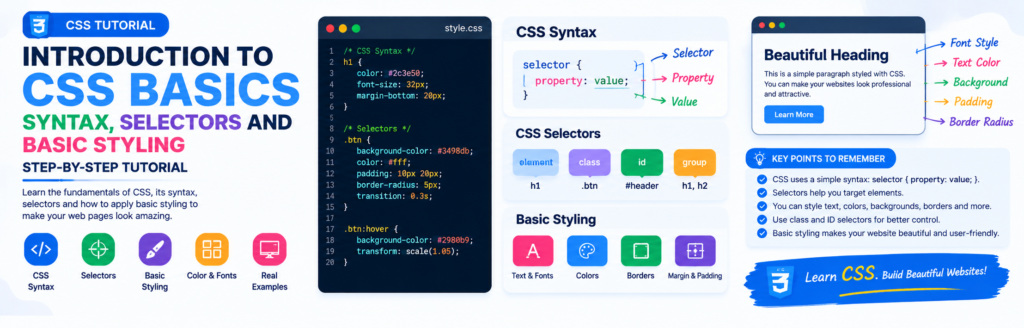
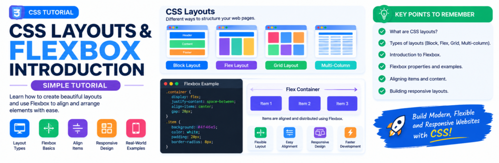
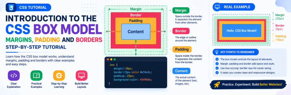
Understanding how Media Queries work is key for truly responsive layouts – I found a helpful overview of responsive design principles, including some visual examples This tutorial is a good starting point for getting a handle on the CSS itself.